background
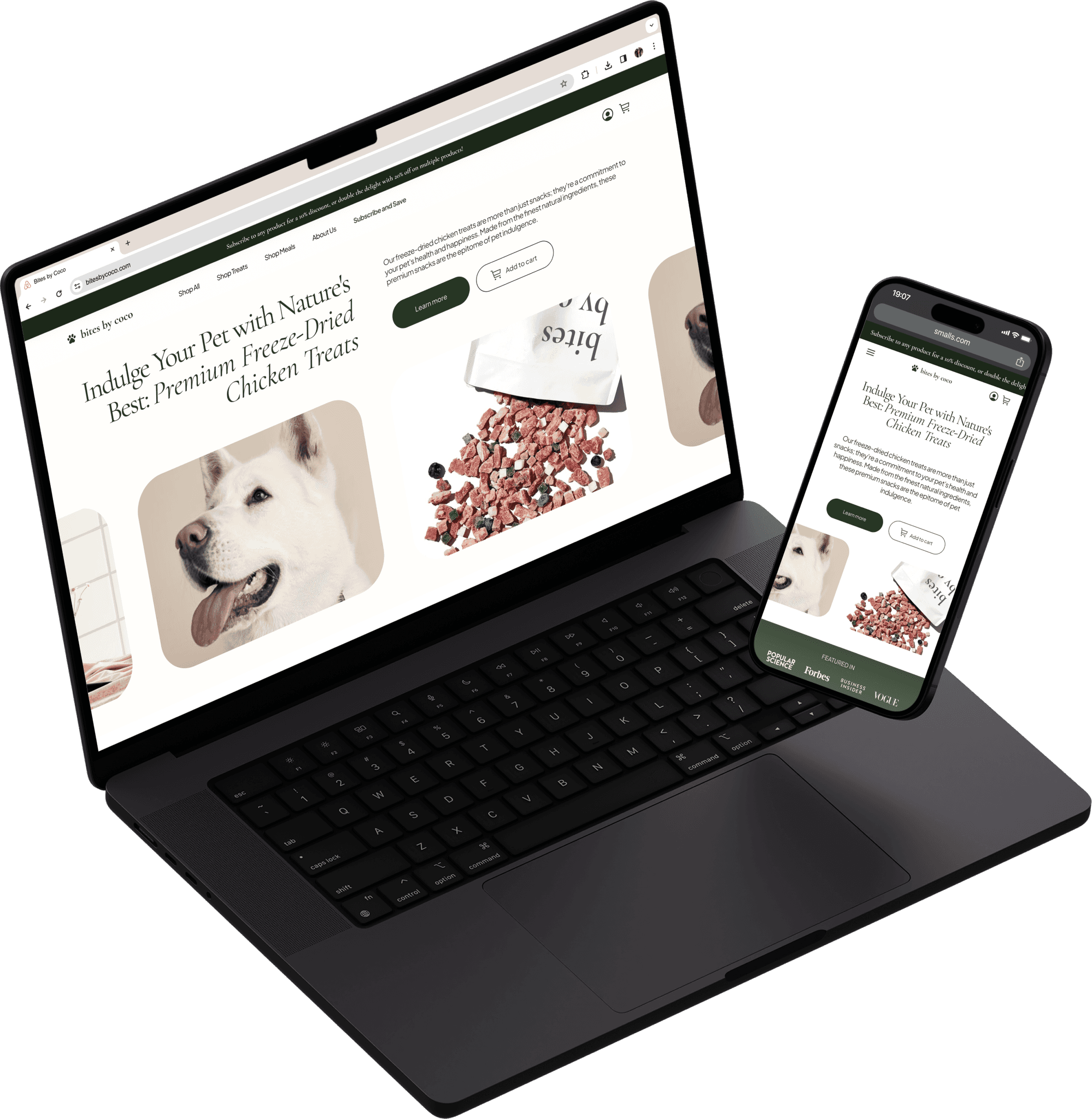
Bites by Coco is an e-commerce pet shop looking to redesign their landing page to align more with their business goals. This was a personal project, and I gave myself one week to complete the redesign. I created both a desktop and mobile version.
my role
For this project, I worked on the UX/UI Design, User Research, Competitive Analysis, Prototyping, Branding.
the result
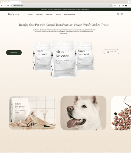
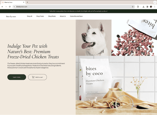
I redesigned the landing page to reflect the upscale and sophisticated nature of the company while also implementing features/content that catered more towards their user base and engaging motion design.
quick glance
understanding the problem
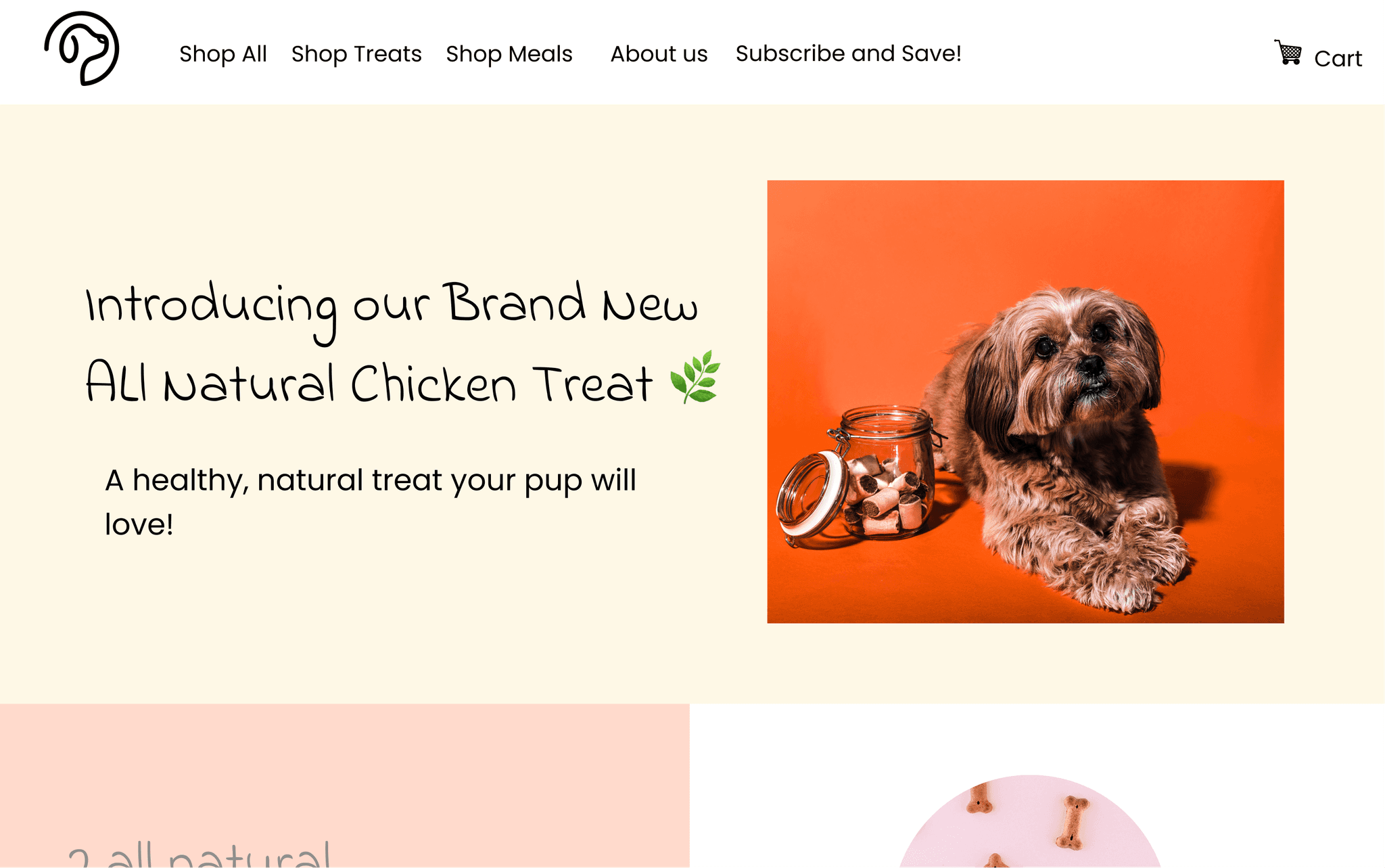
The first thing I do when given a problem is to understand as much as I can about the users, problem space, and the business goals. I do this by channeling my inner Sherlock Holmes and asking as many questions as needed. I also conducted an evaluation of the current site to see the strengths, weaknesses, and opportunities.
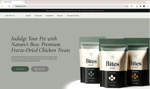
Snapshot of the Current Landing Page
Having all of this information helps me to put myself in the shoes of the user and the business, allowing me to be empathetic and more intentional with my designs.
Seamless process for users to add product to cart, preferably as a subscription
Encourage subscriptions & multiple product purchases
Effectively communicate company’s subscription discount structure
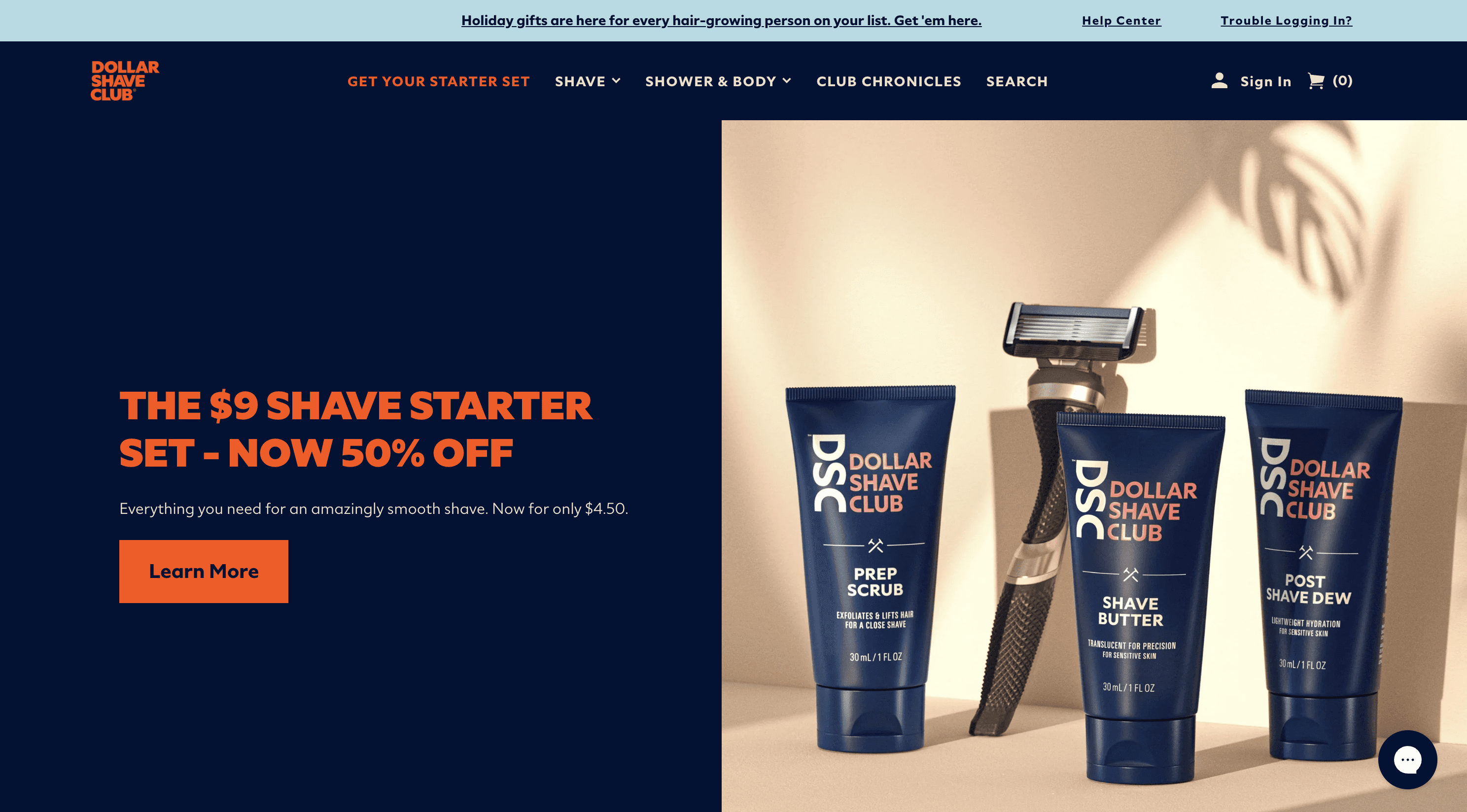
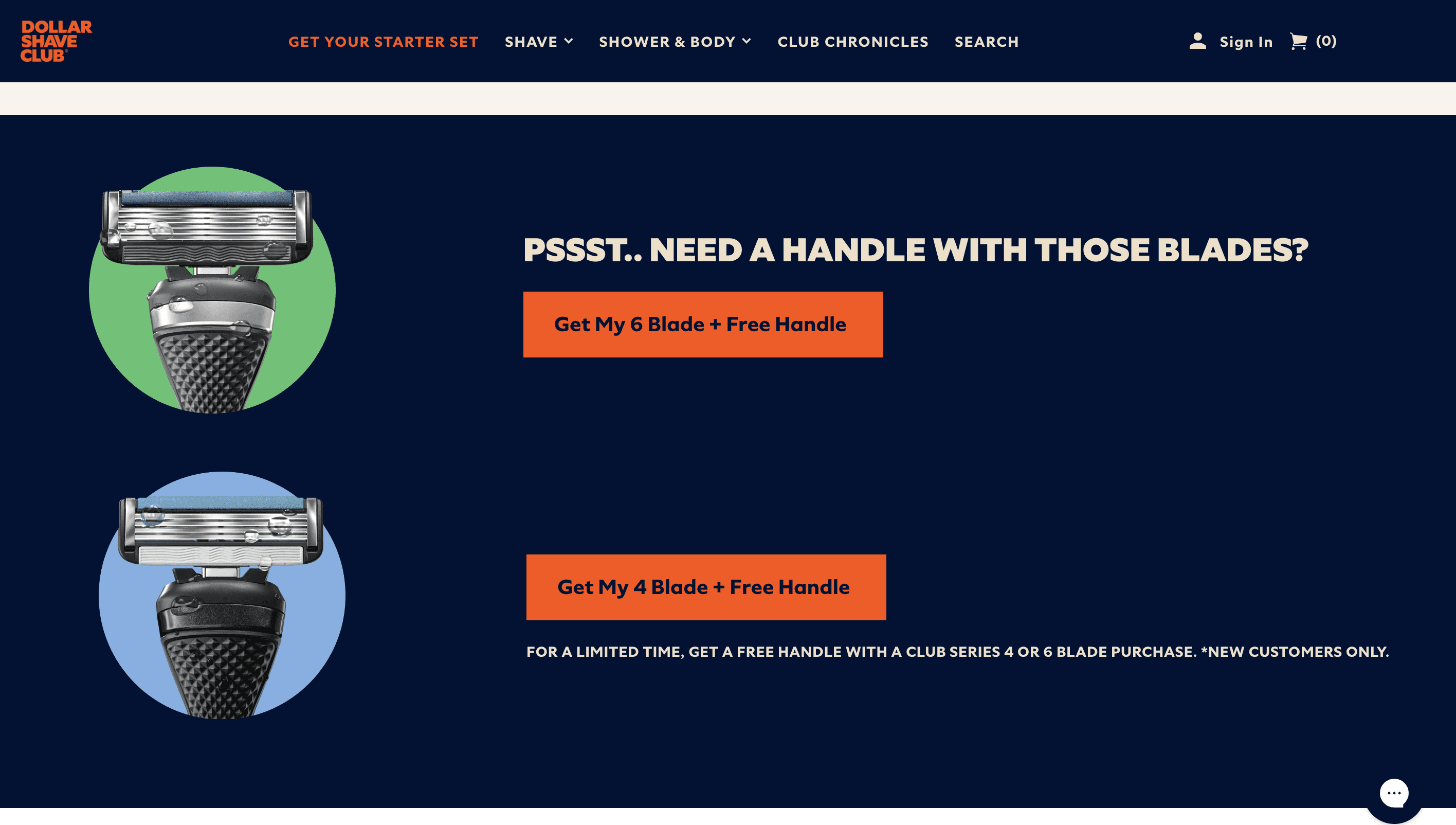
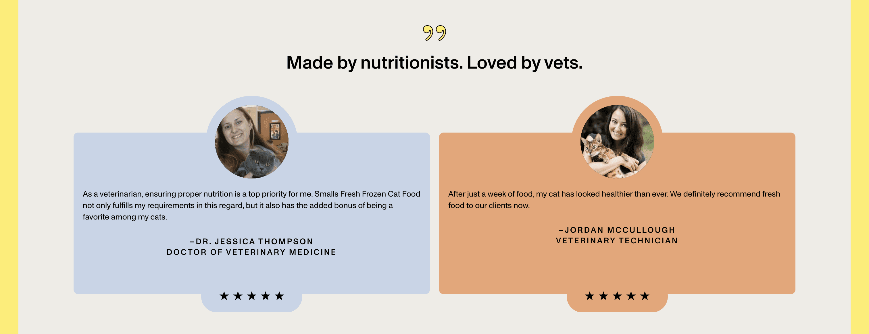
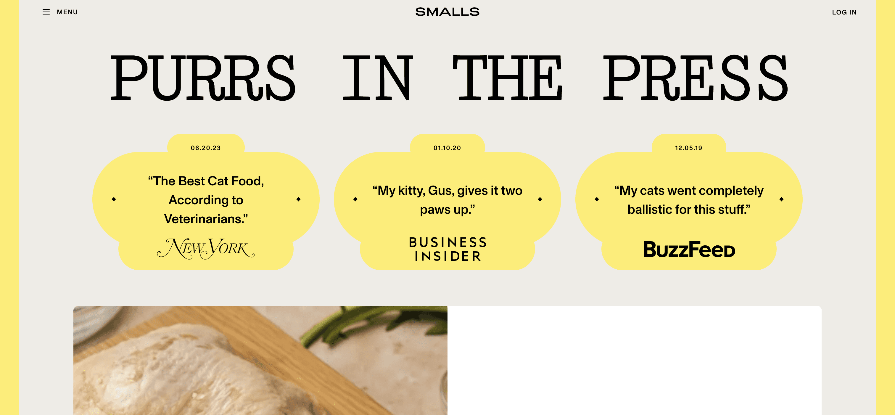
I took a look at the websites of other high-end pet food sites and e-commerce sites that emphasize subscriptions.
The main takeaway was that the value proposition of the companies were strategically presented in a way that convinced users to purchase the product.
Every part of the landing page was a piece of a larger puzzle that was meant to guide users towards the end goal — purchasing a subscription.
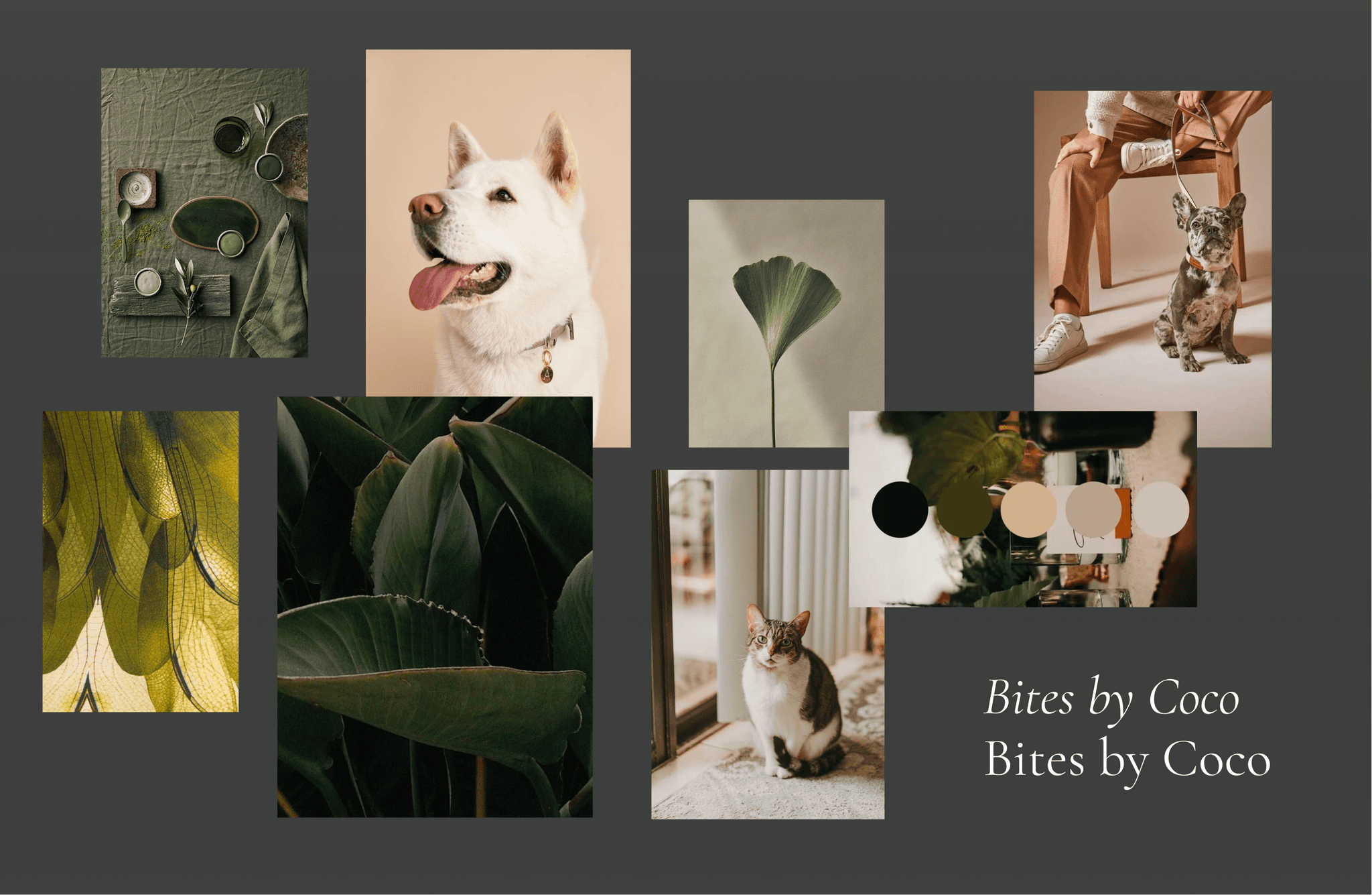
moodboard
ideation
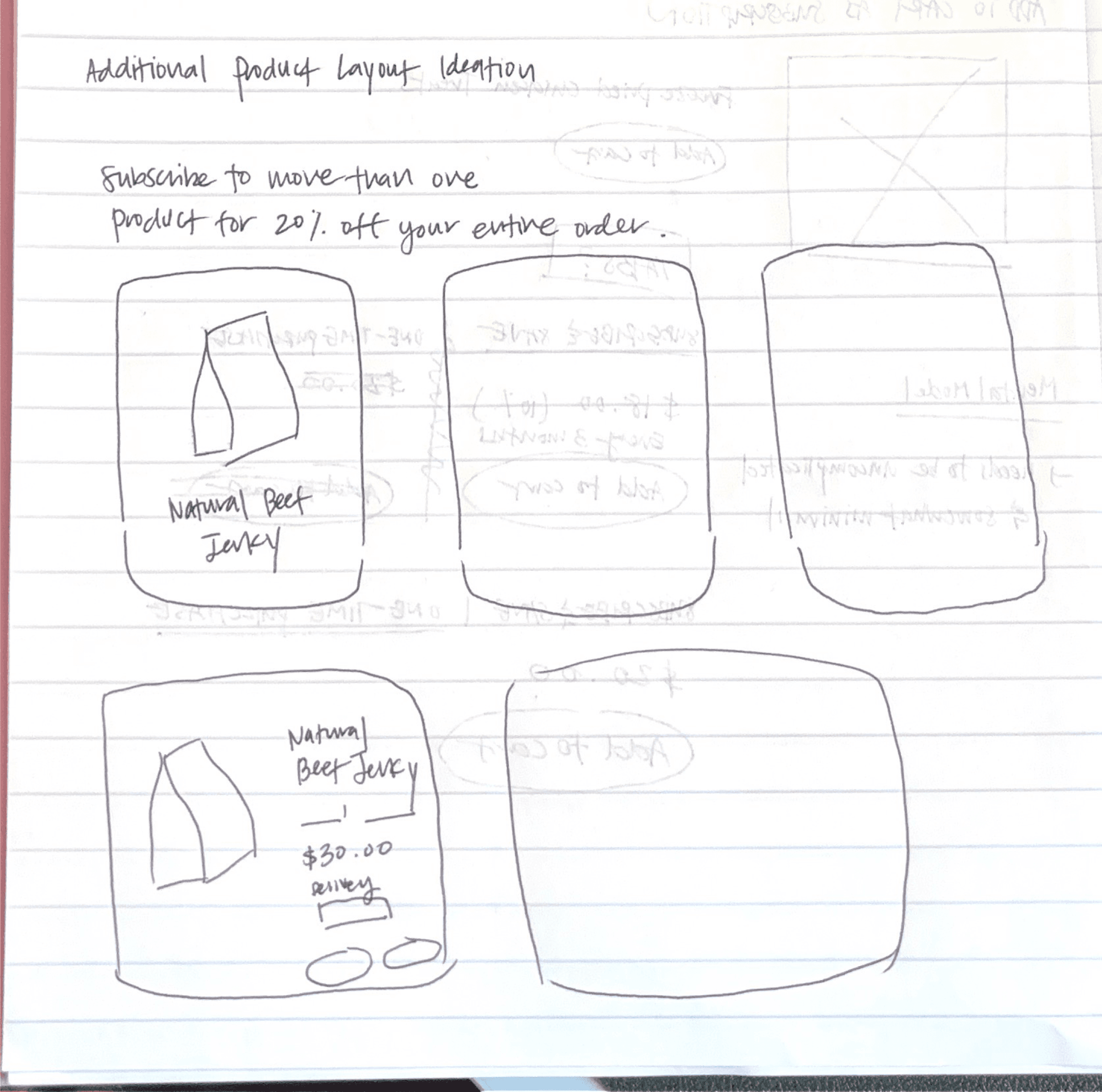
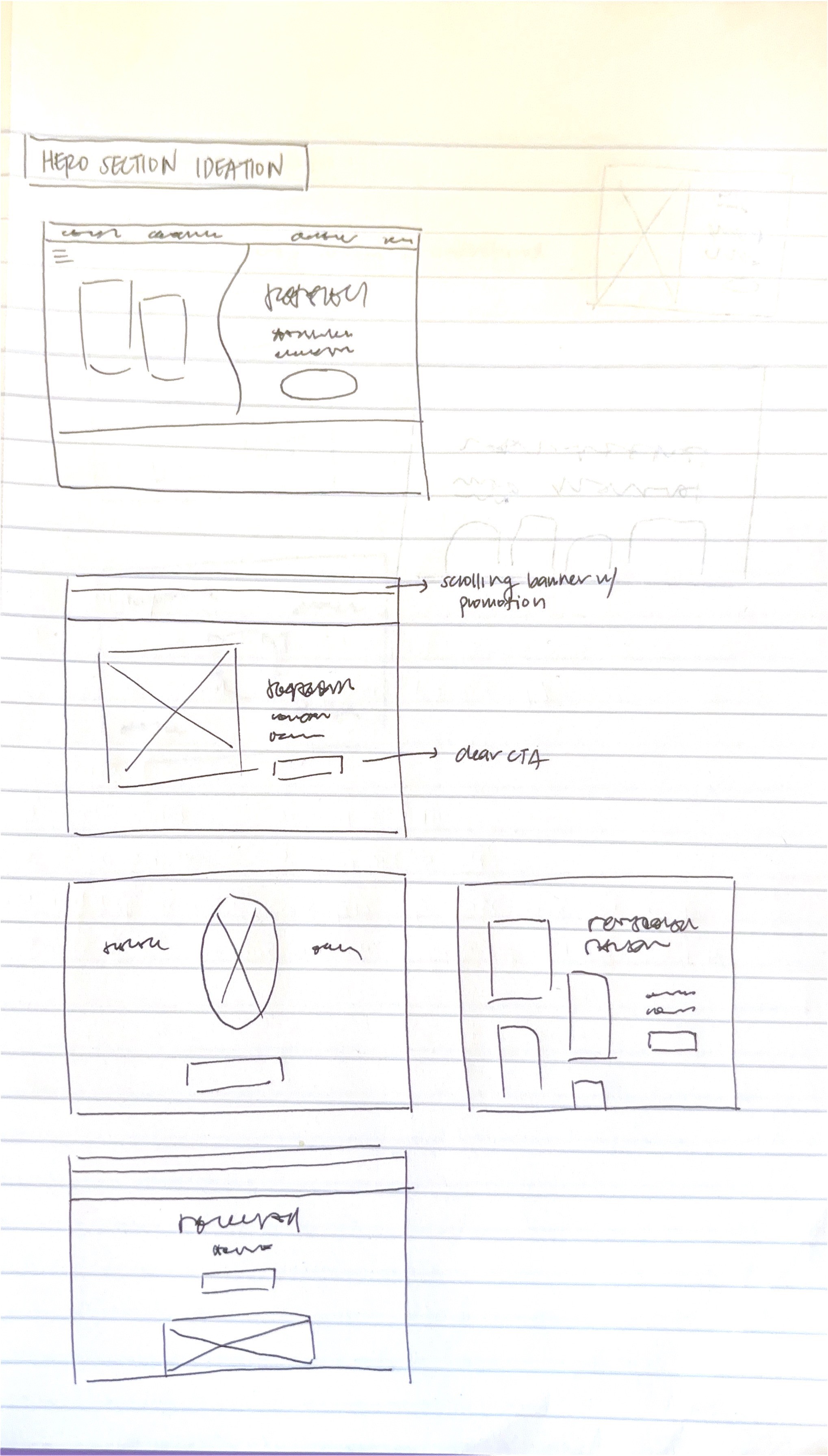
Then, I'll put pen to paper and start sketching out some ideas! During this stage, I try my best to not limit my creativity and let my imagination run wild.
Product Promotion Section
Additional Product Layout
Landing Page
A Few of My Sketches
Then, I'll assess the designs in terms of their value and feasibility and quickly turn them into hi-fidelity mockups.
A Few of the Hi-fidelity Mockup Iterations
final design walkthrough
In terms of the final design, I want to highlight how each section was strategically laid out to build on top of teach other cohesively. Every section is there for a specific purpose and is made to convince users' of the benefits of the product and subscription structure. I hope you like what I've designed!
I implemented a sticky promotion bar at the top so that users would always be aware of the subscription discount structure.
I also improved the copy and visuals so that its much more engaging and reflective of a sophisticated and high-end company.
The awards section was added to improve the credibility of the brand.
Finally, when users would click on the CTA, they would be redirected to the product information section of the landing page.
Immediately after the user learns about all of the amazing qualities about the company and hears the raving reviews, they're presented with the option to purchase our newest product that we're trying to push.
This was my favorite section! I played around with the best way to present the subscription price and the regular price.
Also, the default selection is the Subscribe & Save option, but users can opt to purchase the regular priced product.
check out the prototypes!
Make sure you're in full screen for the scrolling animations to work!
Make sure you're in full screen for the scrolling animations to work!
